I would be remiss if I didn't mention where the design of most of this site's UI elements came from.
One of the things I do when I'm stuck in a no-participation conference call at work is try to recreate elements from images, games, etc. in HTML & CSS. And one such inspiration I saved recently was a graphic from Murat's recent overview of Proportional Share Schedulers.
I can't find any image attribution on Murat's site, and none of his other posts feature anything like this. Reverse image searching turns up nothing. Unfortunately, I believe this image is AI-generated, but nonetheless, I really like some elements of the aesthetic.
The Step/Job stuff starts losing the plot a bit for me -- Why are they folders? What is meant by the orange and blue "comet" in Step 3? -- but I love a graph paper background, and the transparent notched frames were a fun challenge.
Yes, the two sets of window controls are ridiculous (and probably further evidence of AI involvement). But it also feels like a touch of whimsical maximalism, so I kept them. I even dialed it up by randomizing the FontAwesome icons they display on each pageload.
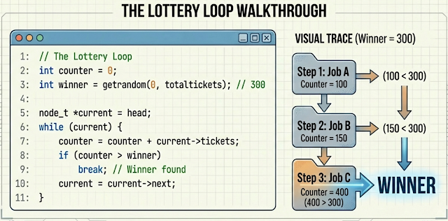
Look at this graphic explaining the Lottery Loop. Neat!
Here we use the non-zero winding rule to draw an octagon clockwise, then draw a smaller one counter-clockwise inside it, effectively punching out the inner shape.
The constant 0.414 (~√2 - 1) is used to maintain an even thickness at the corners. Without such an offset, a 45° line will appear too thin, because the distance from the outer corner to the inner corner is slightly longer than the thickness of the other walls.
Of course, I do realize corner-shape: bevel; is coming, but it's still experimental at the time of writing. So for now, I did it like this
.bevel-frame {
  box-sizing: border-box;
  padding: 24px;
  position: relative;
  width: 90%;
}

.bevel-frame::before {
  background: var(--border-color);
  content: "";
  inset: 0;
  position: absolute;

  clip-path: polygon(
    /* Draw outer shape */
    var(--bevel) 0%, calc(100% - var(--bevel)) 0%, 100% var(--bevel), 100% calc(100% - var(--bevel)),
    calc(100% - var(--bevel)) 100%, var(--bevel) 100%, 0% calc(100% - var(--bevel)), 0% var(--bevel),
    /* Move to start of inner shape, overlapping the 1st point */
    var(--bevel) 0%,
    /* Inner shape is offset by border-thickness
       Note: Use a slight multiplier (0.414) on the bevel offset for diagonal math.
             The distance across a 45-degree angle is sqrt(2)*thickness. Using
             {sqrt(2) - 1 ~= 0.414} as the offset ensures the border looks uniform
             at the corners.
    */
    calc(var(--bevel) + var(--border-thickness) * 0.414) var(--border-thickness),
    var(--border-thickness) calc(var(--bevel) + var(--border-thickness) * 0.414),
    var(--border-thickness) calc(100% - var(--bevel) - var(--border-thickness) * 0.414),
    calc(var(--bevel) + var(--border-thickness) * 0.414) calc(100% - var(--border-thickness)),
    calc(100% - var(--bevel) - var(--border-thickness) * 0.414) calc(100% - var(--border-thickness)),
    calc(100% - var(--border-thickness)) calc(100% - var(--bevel) - var(--border-thickness) * 0.414),
    calc(100% - var(--border-thickness)) calc(var(--bevel) + var(--border-thickness) * 0.414),
    calc(100% - var(--bevel) - var(--border-thickness) * 0.414) var(--border-thickness),
    calc(var(--bevel) + var(--border-thickness) * 0.414) var(--border-thickness)
  );

  z-index: -1;
}